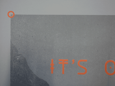
They came out fairly well. For experimental's sake, I chose to do one background with a knocked-out effect and the other one a solid background. Talking to Mike Flowers, he suggested that I needed to half tone my background images, using between 50 and 65 lines per inch (lpi) to be able to successfully transfer my images to a screen.
An issue that came up with when I took my negatives to be exposed, was I printed my background image with the desired opacity which was 20%. Neil from Vernon's print resource told me that I needed to print my negatives at 100%, then choose an appropriate ink that mimic's the opacity I needed.
I therefore printed the background images in a light grey, and experimented with luminescent orange and a bright blue for the typographic aspect of the print. I will photograph them properly later, but for now, here are the outcomes:
There were a few issues with the first couple of prints in my wonderland print. There was trouble with the emulsion on the screen, which led to blockages resulting in the ink failing to pass through. It is the most apparent on the framing devices, the top parts of the Ls in 'will' and on the small 'Of Monsters Of Men' labelling at the bottom of the print:
I also experimented with parcel tape to take away elements of the design - in this case the framing devices. I also purposely misaligned the overprints to see if it gave any aesthetic value, I was looking for a happy accident. Unfortunately, it looks terrible but it was good to experiment. The misaligned orange overprint demonstrates the ink isn't suited to overprinting - it makes the bright, luminous orange look murky and dull.
I got distracted and accidentally screenprinted straight onto the bed. The next print came out with recurring dots courtesy of the air holes, which looks sort of fitting with the half-tone nature of the background image. It could prompt experiments with circular patterns in future designs.


No comments:
Post a Comment